By Soomin Kim
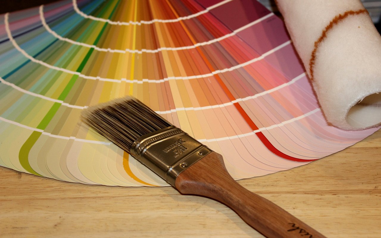
Paint is the most affordable transformation available to a homeowner — and the most frequently mishandled. The color that looked perfect on a swatch under a store's fluorescent lights can look entirely different on your walls at 6pm on a Tuesday, and that surprise is almost always avoidable. I see paint choices affect how buyers respond to homes throughout Austin, and the patterns are consistent enough to be instructive. Here's what I'd want you to know before you open a can.
Key Takeaways
-
Light — natural and artificial — changes how every color reads in a space
-
Different rooms have different functional needs that should drive color choices
-
Austin's aesthetic favors warmth, texture, and connection to the outdoors
-
Testing before committing saves significant time and money
Understand How Light Affects Color First
Every paint color is a relationship between pigment and light — and the light in your specific home at your specific time of day is the only version that matters. This is the step most people skip, and it's the reason most paint regrets happen.
How to Read Light Before You Choose
-
Orientation matters: north-facing rooms receive cool, indirect light that makes warm colors feel muddy and cool colors feel cold — lean toward soft warm whites and mid-toned neutrals
-
South-facing rooms get the most consistent natural light and are the most forgiving — nearly any palette works, but bold colors come alive here
-
East-facing rooms are bright in the morning and dim by afternoon — colors read differently at different times of day and should be evaluated across the full daily arc
-
Austin's intense summer light is particularly bright and saturating — colors that feel right in a showroom can read washed-out or harsh once Austin sun hits them; always test at midday
-
Artificial lighting temperature (warm vs. cool bulbs) shifts perceived color significantly — evaluate swatches under the same bulbs you actually use
Choose Colors by Room Function
Color psychology is real, and the function of each room should anchor the palette you choose for it. A color that feels energizing in a kitchen can feel exhausting in a bedroom.
Room-by-Room Color Guidance
-
Living areas: warm whites, soft greiges, and muted earth tones create the sense of welcome and ease that makes people want to stay — overly stark whites can feel clinical rather than calm
-
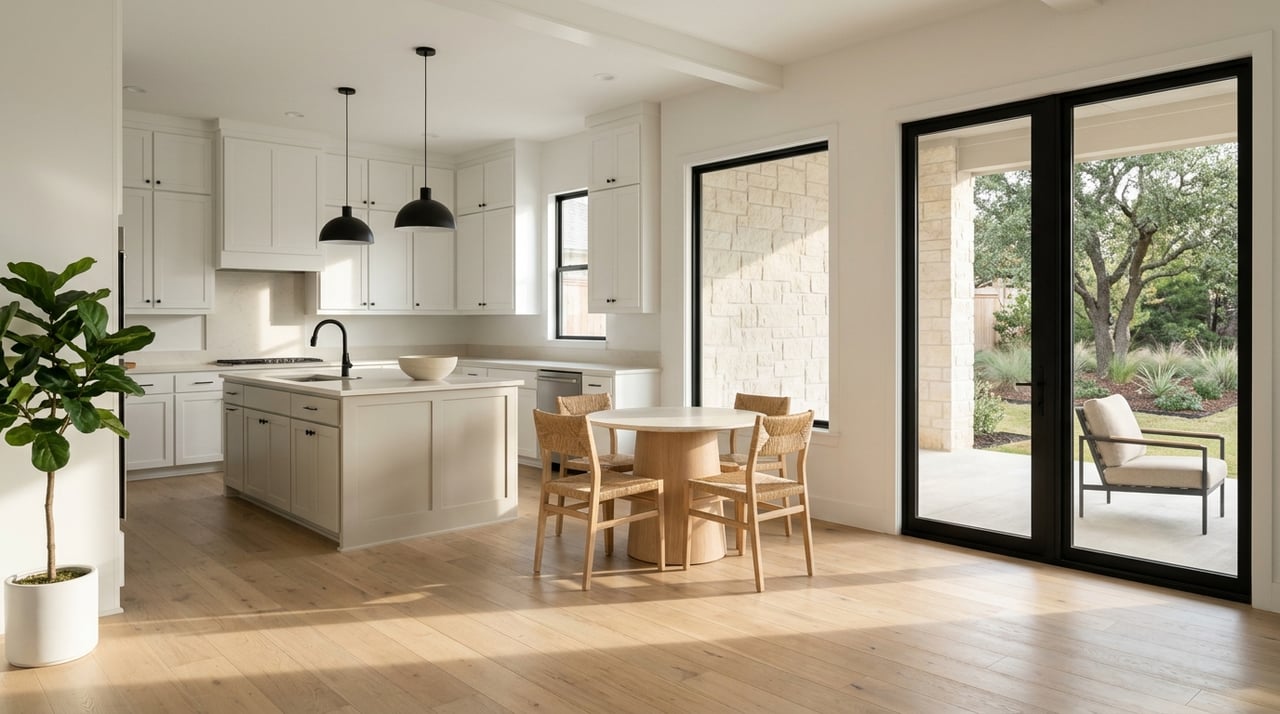
Kitchens: slightly warmer tones than the rest of the home photograph better and make the space feel alive; white kitchens work best when the white has a warm rather than cool undertone
-
Bedrooms: cooler, softer tones — dusty blues, sage greens, and warm lavenders — support the restful function of the space without feeling cold
-
Home offices: medium-value tones with some saturation help maintain focus; avoid both extremes — stark white creates glare, and very dark colors can feel oppressive over long work sessions
-
Bathrooms: the most flexible room in the house given smaller scale — this is where bolder choices or deeper tones work without overwhelming
Work With Austin's Aesthetic
Interior paint colors for Austin homes tend to work best when they acknowledge what makes this city distinctive — the natural landscape, the warm light, and an aesthetic that blends warmth with a certain effortless confidence.
What Works Well in Austin Specifically
-
Warm whites and off-whites: Benjamin Moore's White Dove, Sherwin-Williams Alabaster, and similar warm-toned whites are consistently popular for good reason — they work with Austin's light rather than against it
-
Earthy mid-tones: terracotta, warm clay, dusty sage, and muted ochre connect interiors to Central Texas's natural palette and photograph beautifully
-
Deep accent walls: moody greens, charcoal blues, and warm navies used on a single feature wall add depth without committing a full room to a dark tone
-
Limewash and textured finishes: increasingly popular in Austin's more design-forward homes — they add warmth and organic variation that flat paint doesn't achieve
Test Before You Commit
A Process That Saves Real Money
-
Purchase sample pots and paint at least two 12x12 inch swatches on the actual wall — never evaluate on white paper
-
Live with the samples for 48 hours, checking at morning, midday, afternoon, and evening under artificial light
-
Evaluate swatches next to your fixed elements: flooring, cabinetry, countertops, and upholstery
-
When in doubt between two colors, the lighter one almost always photographs better — which matters whether you're planning to sell or simply want your home to feel its best
Frequently Asked Questions
Why Does My Paint Color Look Different Than the Swatch?
Swatches are evaluated under controlled lighting conditions that rarely match your home. The larger the painted area, the more intense the color reads — what looked subtle on a small chip can feel saturated on a full wall. Always test at scale in your actual space before committing.
What Paint Colors Are Resonating With Austin Buyers Right Now?
Warm whites, soft greiges, and earthy mid-tones consistently perform well in Austin listings. Stark cool whites have faded in popularity, and the warmth-forward palette that reflects Austin's natural environment tends to photograph better and feel more inviting during showings.
Should I Use the Same Color Throughout My Home or Vary It?
A single cohesive neutral throughout creates flow and makes spaces feel larger — a strong strategy if you're preparing to sell. For a home you're living in long-term, varying tones by room while staying within a consistent warm or cool family creates personality without visual chaos.
Contact Soomin Kim Today
Whether you're refreshing your home for personal enjoyment or preparing it for market, color choices have real consequences. If you want a perspective on what's working in Austin right now, reach out to me at Soomin Kim and let's talk through it.
I'm here to help your home look — and feel — its best.
I'm here to help your home look — and feel — its best.